The Challenge: A well-established 20-year-old catering business needed a complete strategic rebranding to launch a new, premium coffee break service called "KAWA." The goal was to create a brand that would appeal to high-end corporate clients while honoring the Polish family heritage of the two sister-founders.
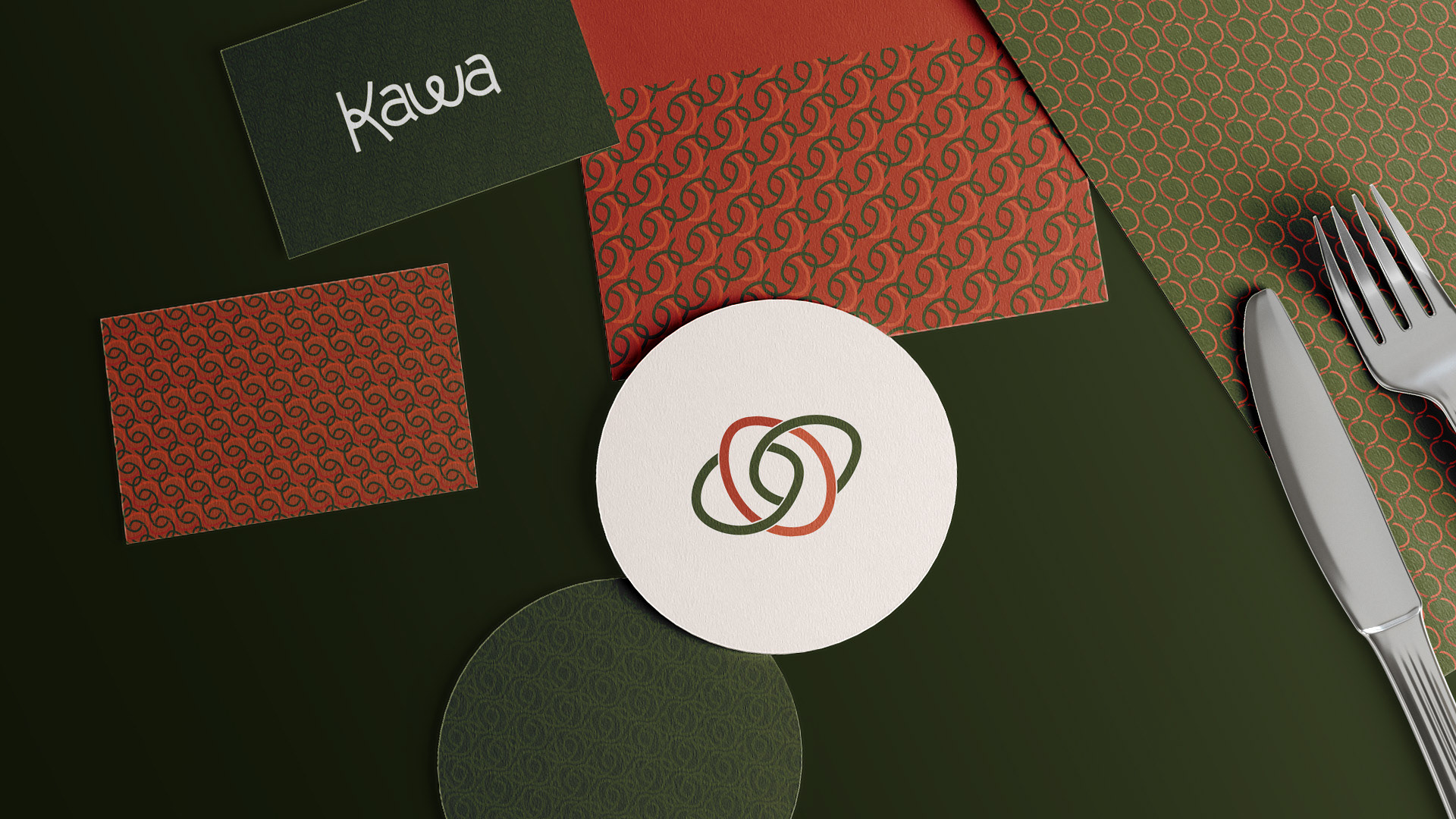
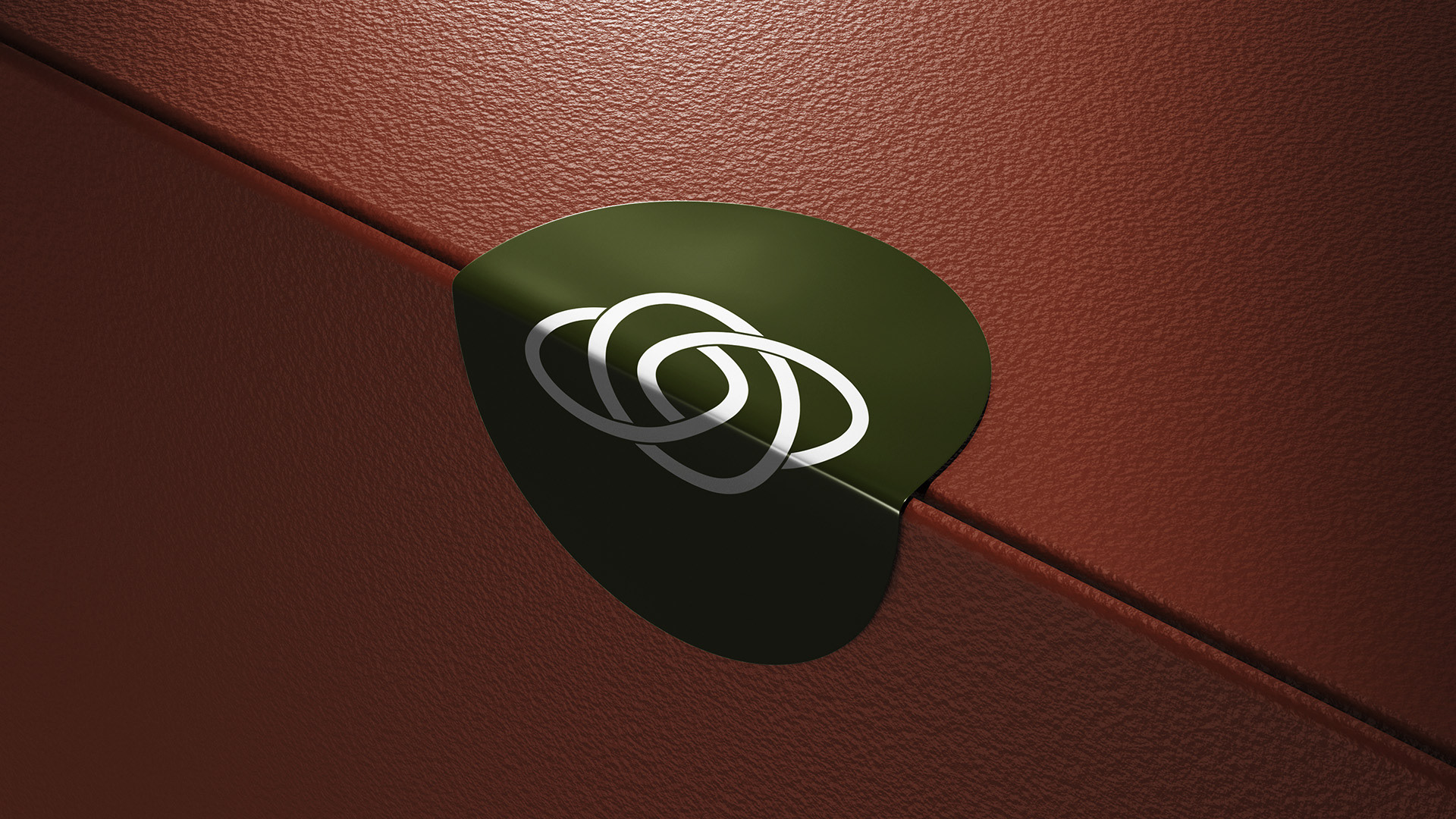
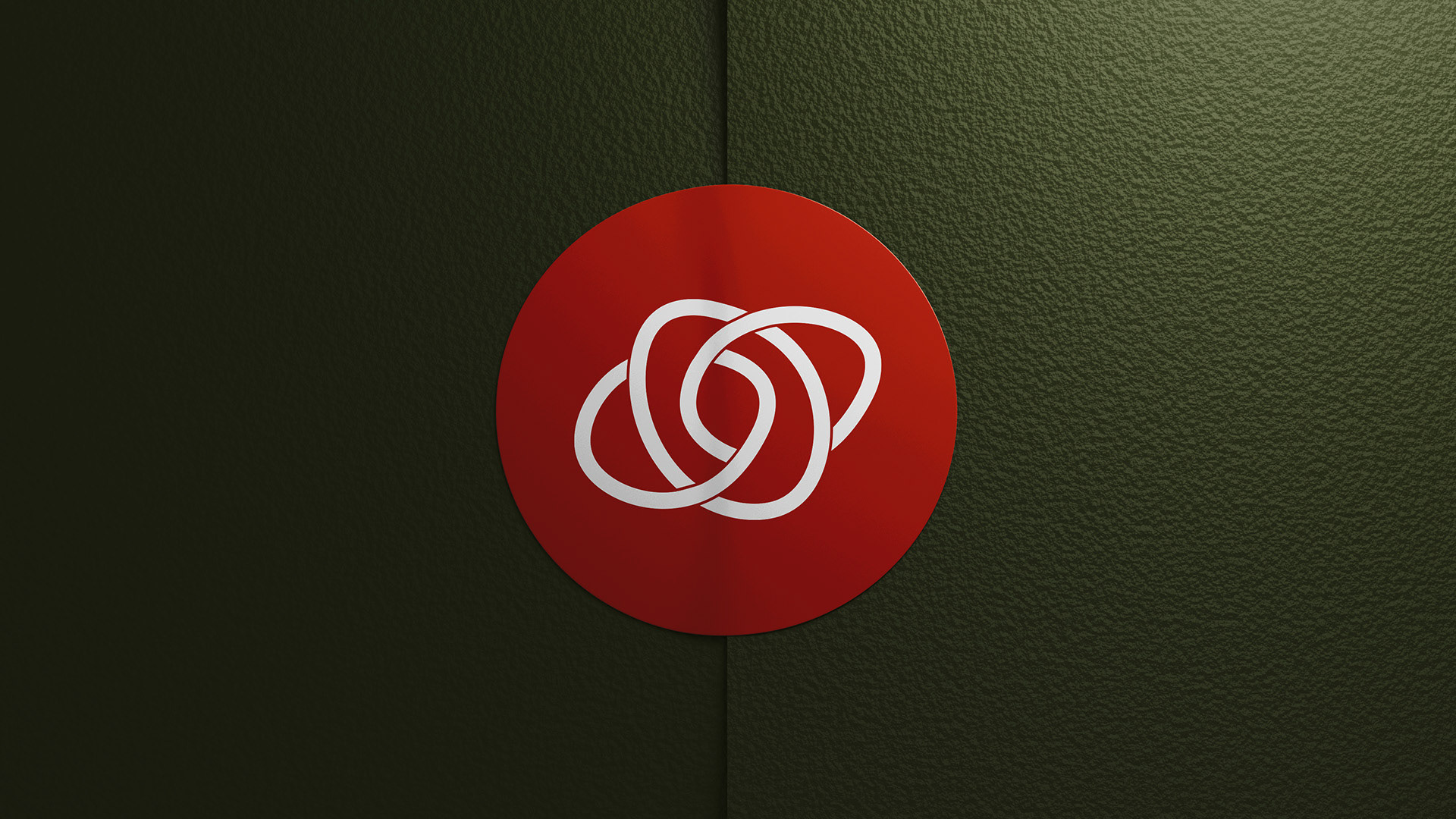
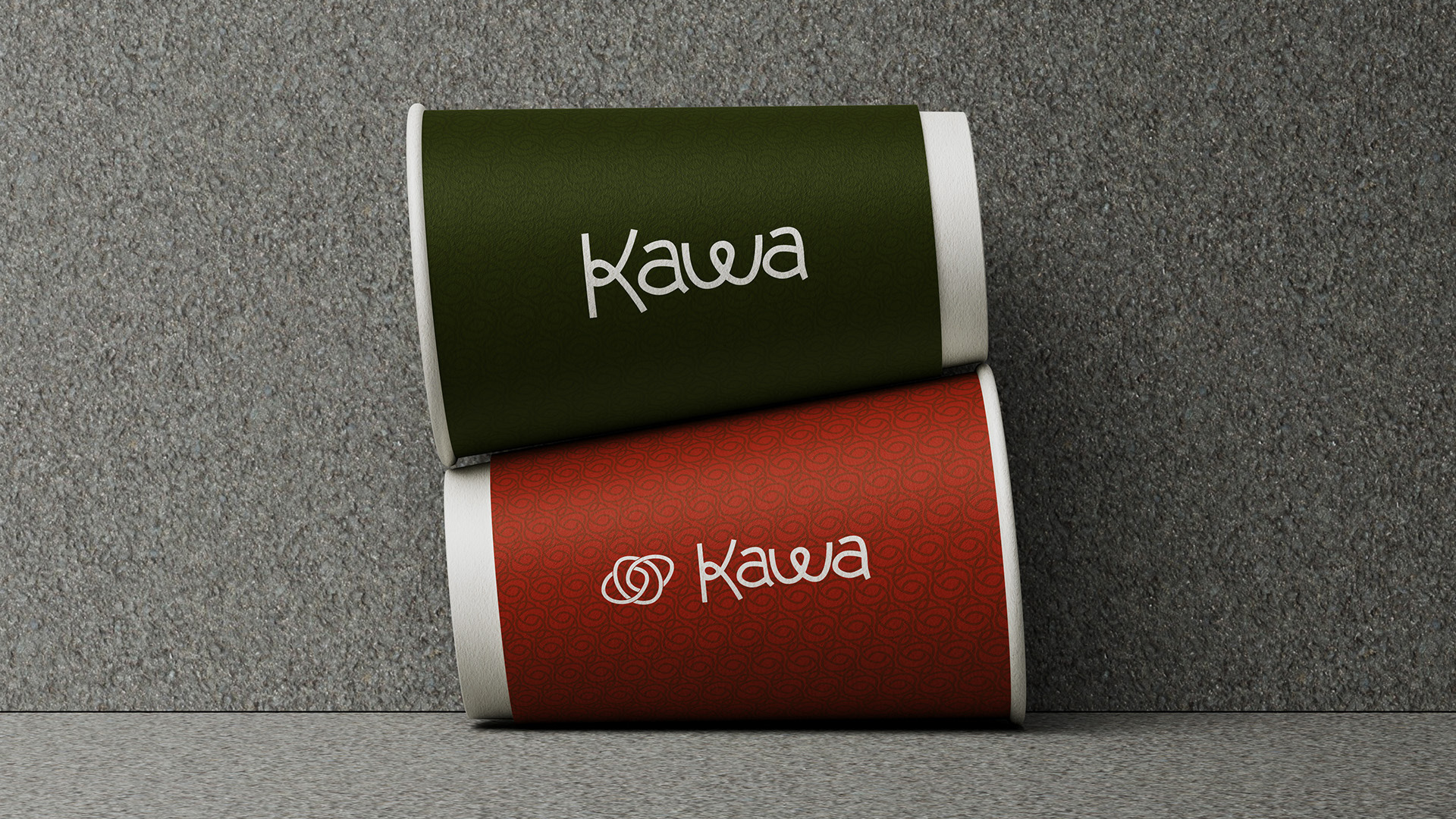
The Solution: I developed a comprehensive brand identity rooted in the company's soul. The name "KAWA" (Polish for "coffee") was the foundation. The logo I designed is a visual storytelling piece, representing three key concepts in one: the coffee bean (the product), a conversation at a table (the experience), and the bond between the two sisters (the soul). The entire visual system, from the color palette inspired by the coffee plant's life cycle to the custom typography, was crafted to convey a sense of artisanal quality and sophistication.
The Impact: The rebranding was a huge success, receiving immediate client approval with zero revisions. The new identity provided the founders with the confidence to reposition themselves in the market, target larger corporate clients, and align their pricing with their premium offering. The result was a powerful, meaningful brand that became the foundation for their new chapter of business growth.